
Wynde is a remote user research platform for product teams.
The goal was to design a concept for Wynde’s new UX research guide: information architecture, navigation patterns, typography, content components, and an illustration system.
The legacy version of the guide was functional but outdated.
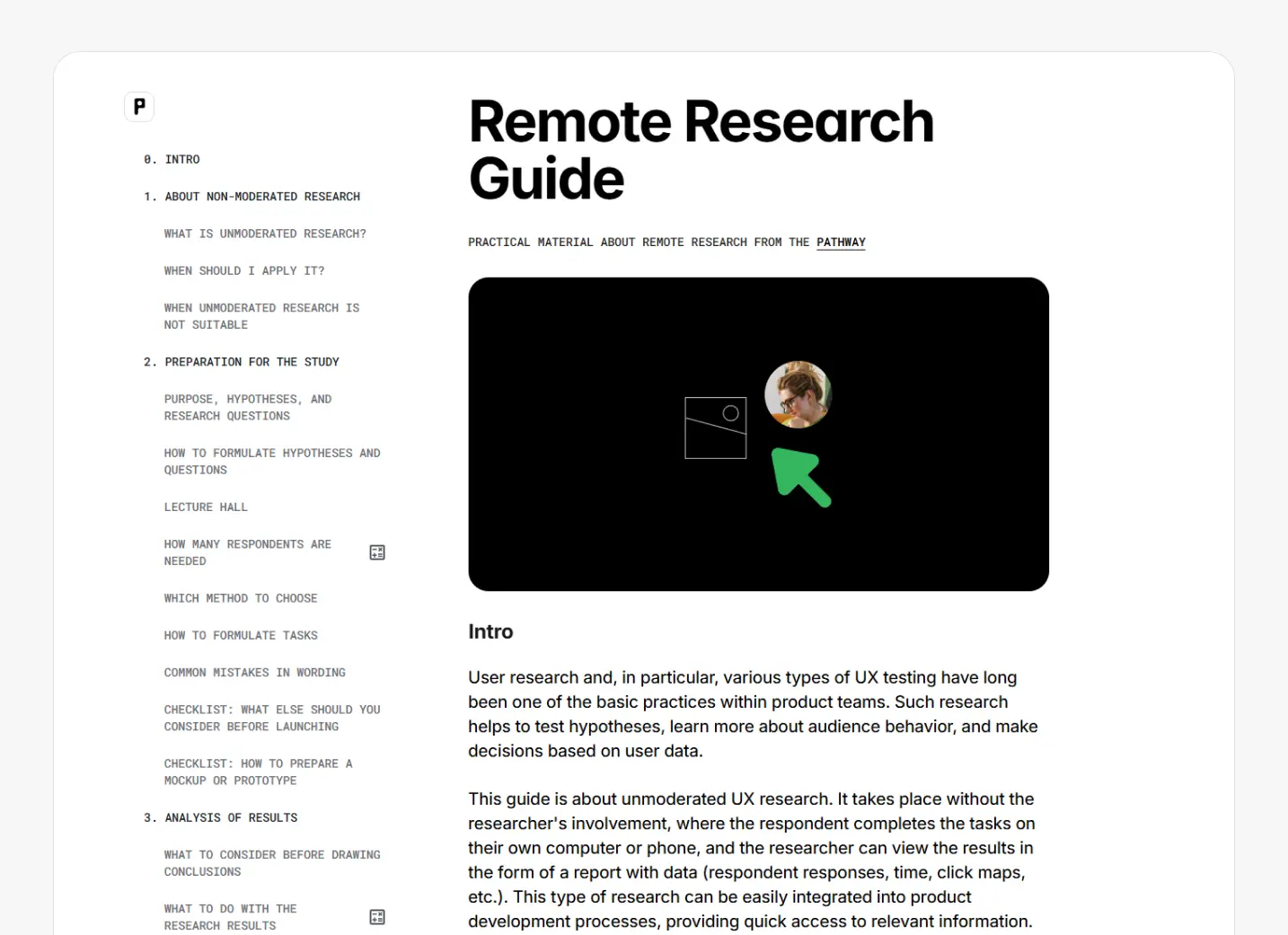
Live legacy version of the guide.
User perspective
I interviewed the Wynde team to understand their vision for the guide. I also spoke with several researchers who are building research-driven cultures within teams (Salmon, Avito, Samokat).

The vision I put together after evaluating the task.
I mapped two roles with their main jobs for this guide.
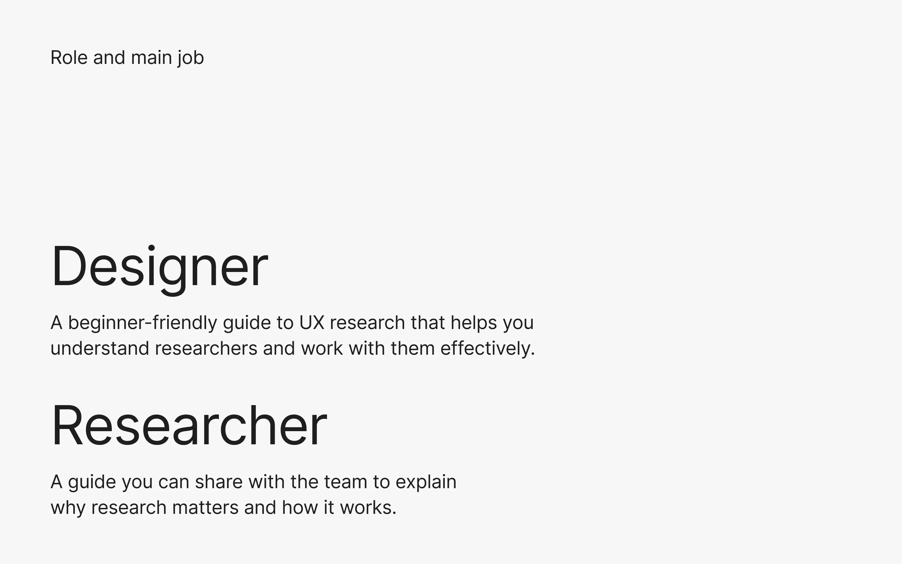
Role and main job.
I identified the most common friction points and turned them into features that supported the job stories for our two roles.

Value proposition.
Research
Research board.
Design process
I started with concepting, selecting references from benchmarks for the layout, typography, color, UI elements, and illustrations.
I skipped wireframes because the main risk wasn’t layout — it was building a scalable system (type, components, navigation rules).
Reference-based layouts let me validate reading rhythm and component needs immediately, while designing the system in parallel.

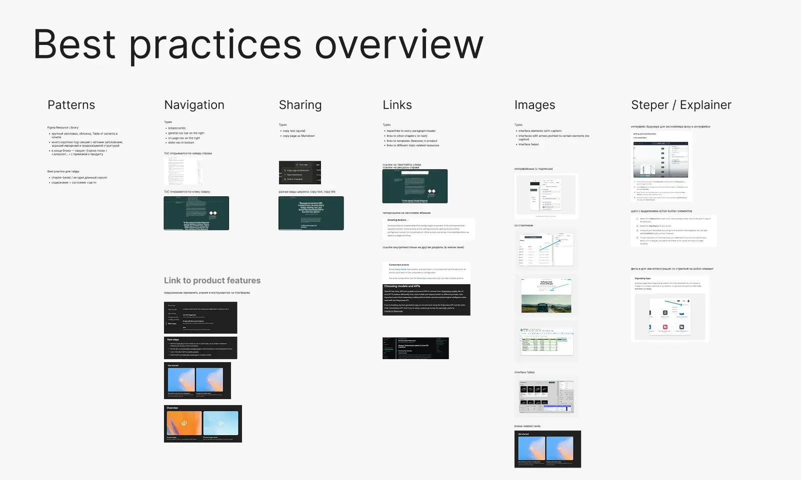
Components snapshot.
What the team got in one week

Work ran in one week sprint.
Navigation
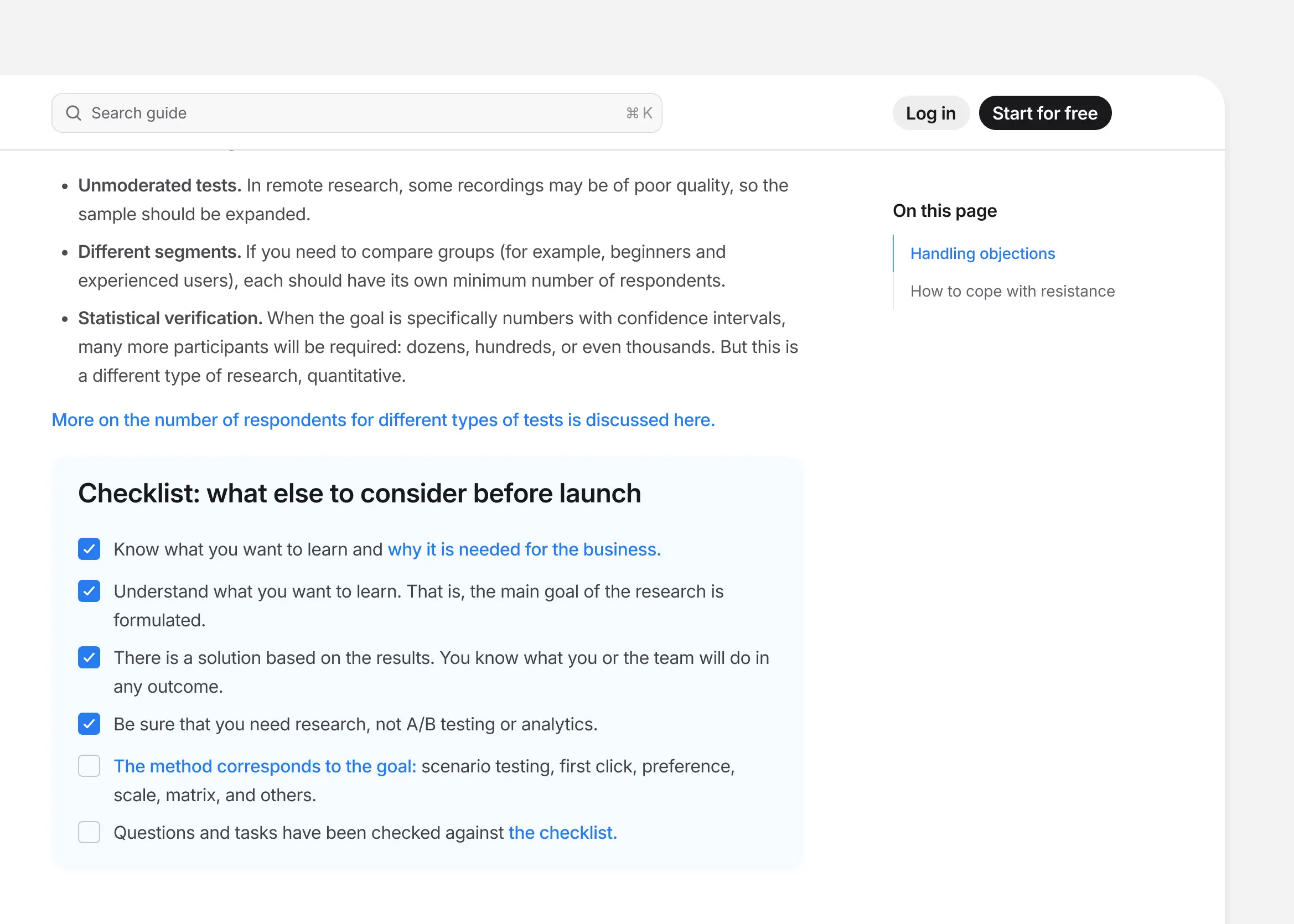
On large guides, users get lost quickly if readers can’t answer: “Where am I?” and “What’s next?”
Persistent left sidebar on the desktop.

Sidebar keeps the guide structure visible and makes chapter switching instant.

A docs-like chapter page with a persistent sidebar and a clear reading hierarchy.
Persistent menu button opens TOC drawer on mobile.
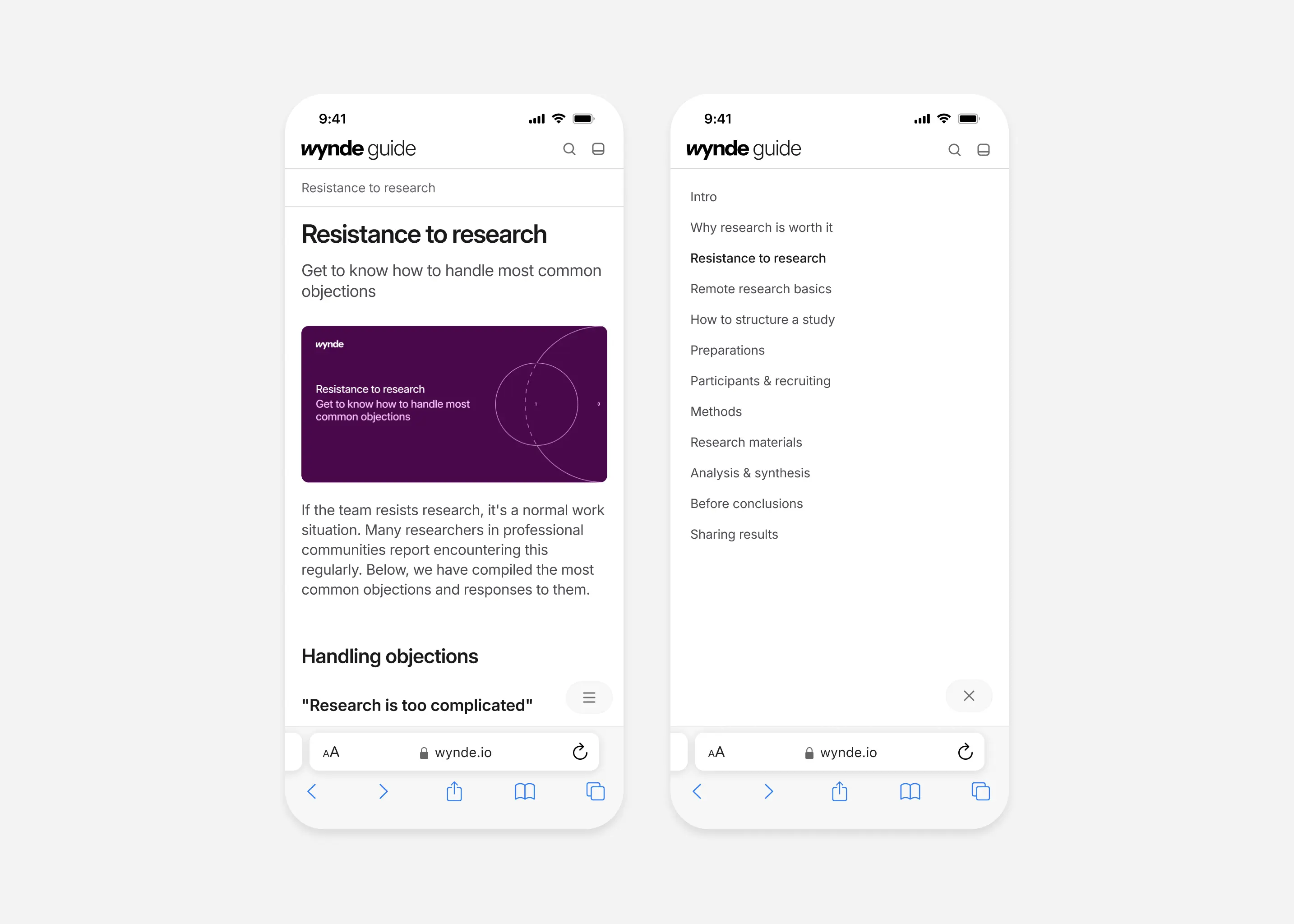
Mobile TOC drawer mirrors desktop structure so users don’t relearn navigation.
On-page navigation
In-page anchors for fast jumps inside long chapters.
Anchors support the ''I need an answer'' mode without breaking reading flow.
Utility menu
Quick access to bookmarks, sign-in, and useful links.

A lightweight utility menu for actions that don’t belong inside the content TOC.
Search flow
When the guide grows, users won’t browse chapters, they’ll search for a term and jump straight into the right section.

Search flow: empty state, results, and jump to the target chapter.
Illustration system
I decided to use schematic, outline, and dashed-line illustrations to complement the content without distracting from the text.

Covers, illustrations and quotes.
Next steps (if team decide to continue)


